
WHITEWASH STUDIO LOGO
Cohesive, professional, and upscale.
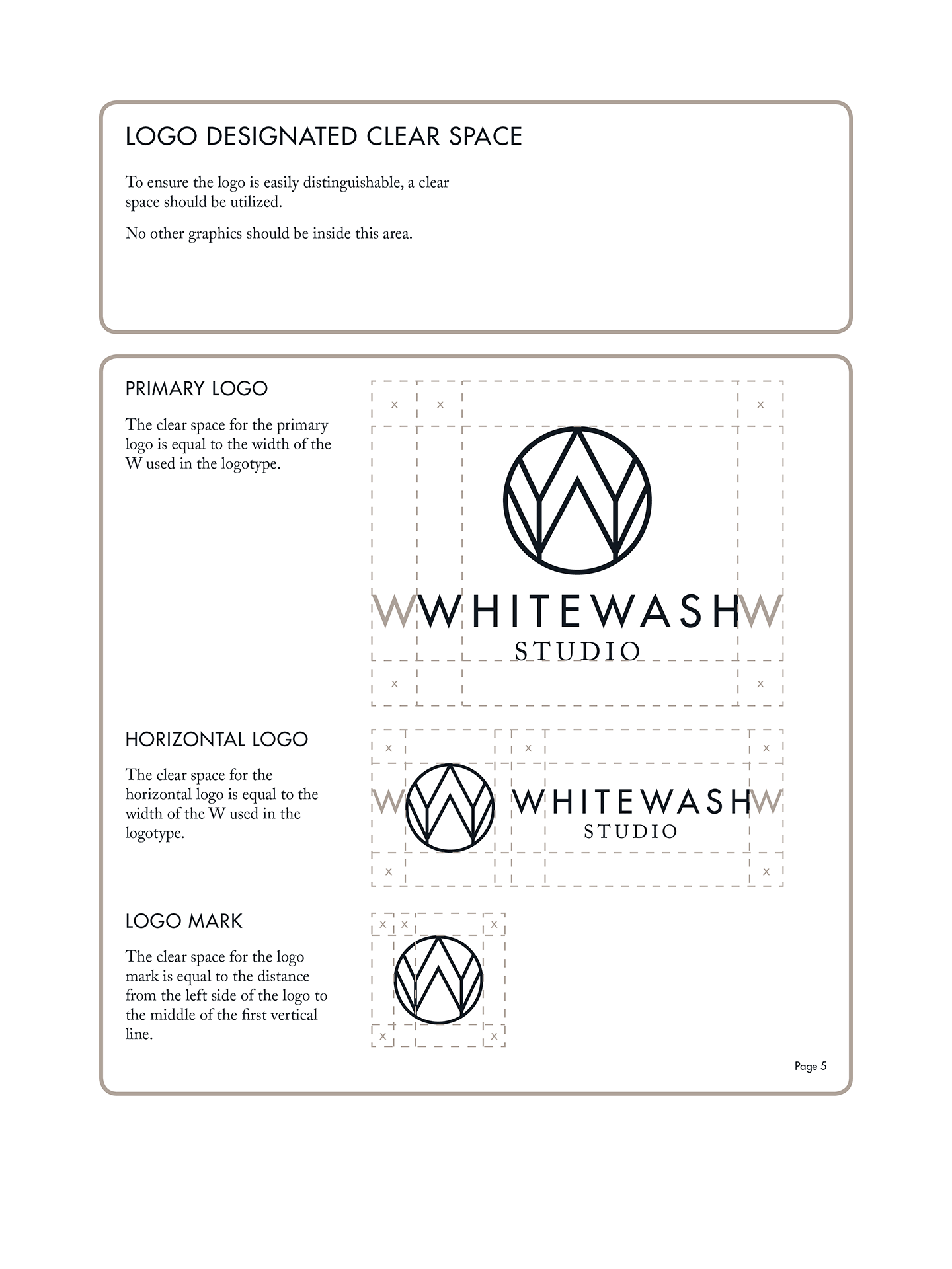
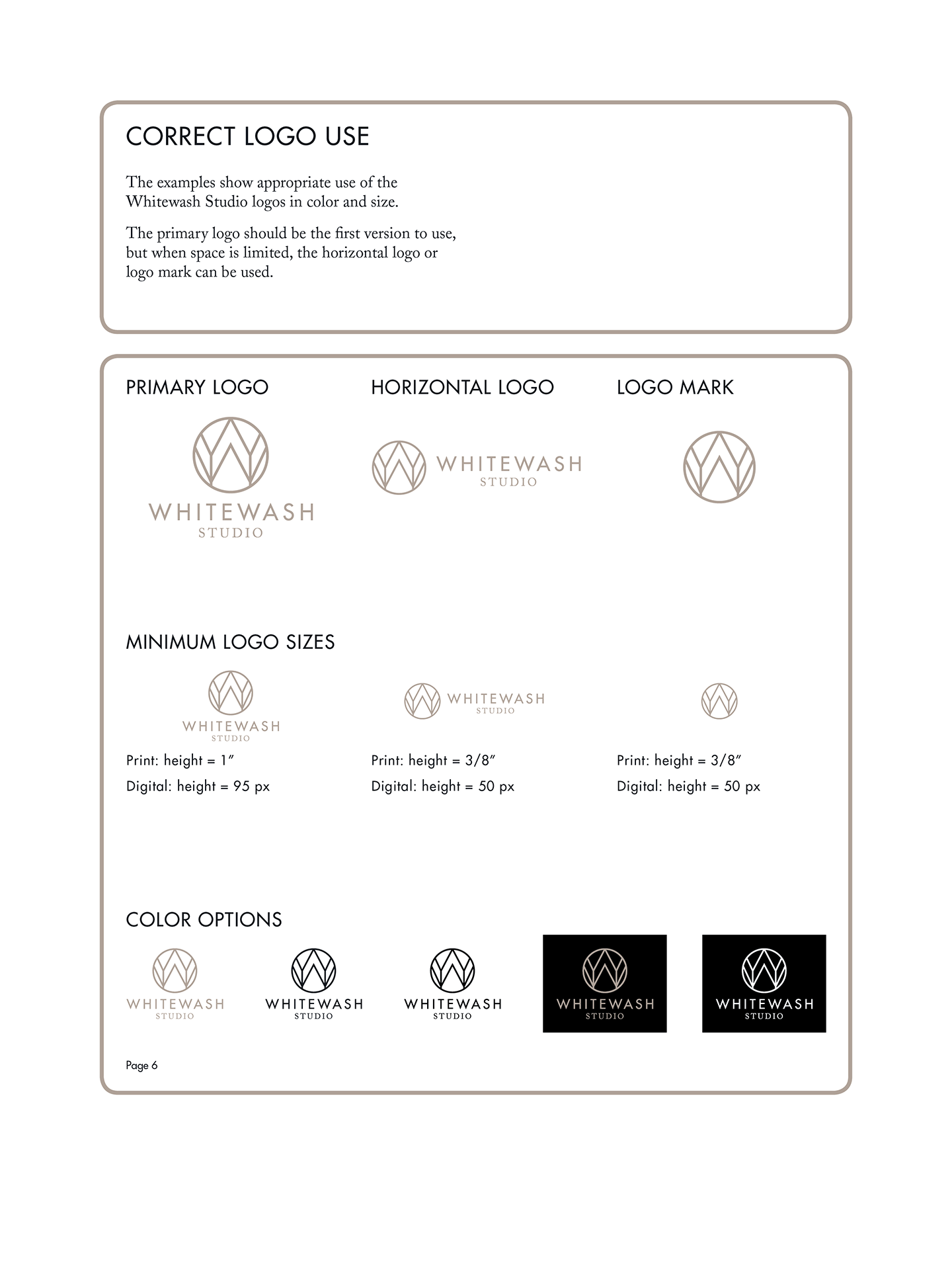
These were the characteristics Marc Sawyer of Whitewash Studio was looking for in his new logo when he initially approached me about designing a visual identity for his architecture business.
At that time, Marc had been working professionally in the architecture industry for a handful of years and wanted a visual identity that would be recognizable as he increased his social media outreach.
After completing the discovery phase, we realized Whitewash Studio needed a logo that would be timeless, versatile, convey his professionalism in the industry, and attract his high-end target clientele.
The complete project included a new visual identity, style guide, and branding collateral (view here).
Client: Whitewash Stuido, LLC
Year: 2016




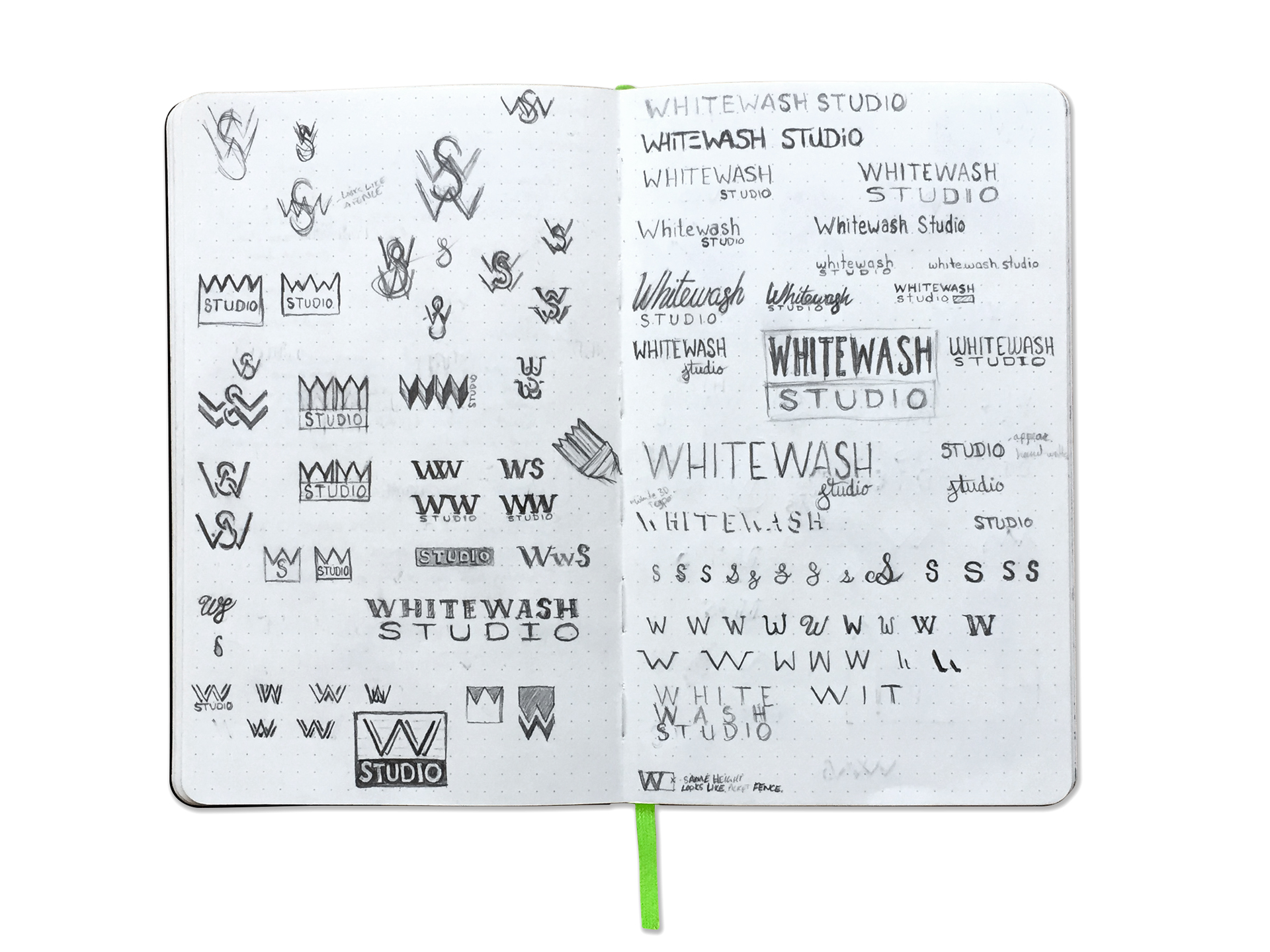
Thumbnail Sketches
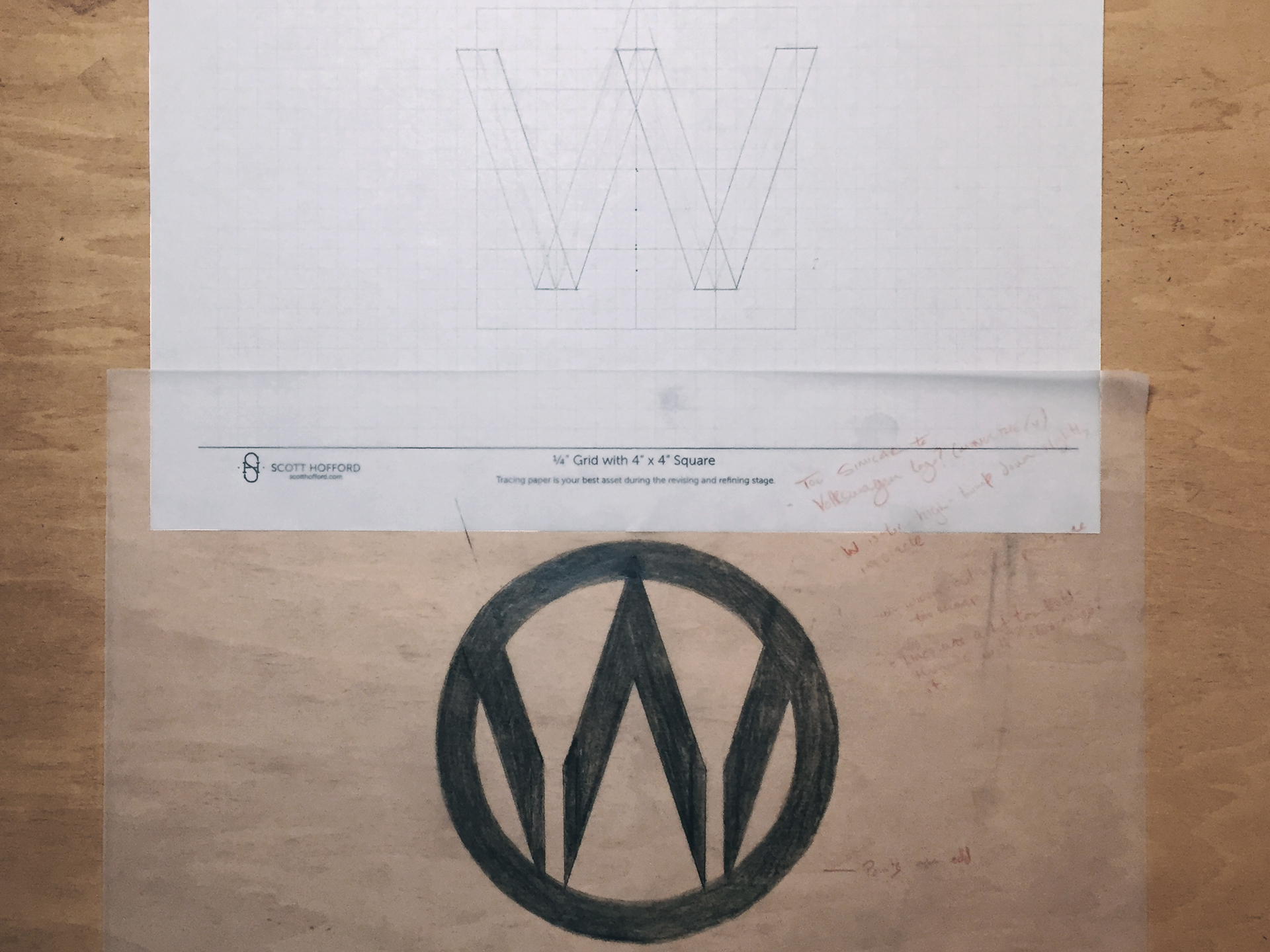
Initial Rough Sketch
Featured Logo Projects:
©2022 Scott Hofford. All Rights Reserved.
©2019 Scott Hofford. All Rights Reserved.
©2019 Scott Hofford. All Rights Reserved.

